input: Difference between revisions
Verisimilar (talk | contribs) m (Macros:Functions:input moved to input) |
Verisimilar (talk | contribs) m (Corrected headers.) |
||
| Line 19: | Line 19: | ||
* ''options'' contains one or more options that control the appearance of the input control or how information entered in the control is treated; options are given in the format ''option=value''. | * ''options'' contains one or more options that control the appearance of the input control or how information entered in the control is treated; options are given in the format ''option=value''. | ||
==Input Types and Options== | ===Input Types and Options=== | ||
===TEXT=== | ====TEXT==== | ||
Yields a text input box. The contents typed in the box are assigned to the variable. | Yields a text input box. The contents typed in the box are assigned to the variable. | ||
====TEXT Options==== | =====TEXT Options===== | ||
;WIDTH=nnn | ;WIDTH=nnn | ||
:Sets the width of the text box. (Default WIDTH=16) | :Sets the width of the text box. (Default WIDTH=16) | ||
===LIST=== | ====LIST==== | ||
Creates a drop-down list of choices. The variable is assigned the index (starting at 0) of the item that was selected. | Creates a drop-down list of choices. The variable is assigned the index (starting at 0) of the item that was selected. | ||
====LIST Options==== | =====LIST Options===== | ||
;SELECT=nnn | ;SELECT=nnn | ||
| Line 51: | Line 51: | ||
:The size of the icon. (Default ICONSIZE=50) | :The size of the icon. (Default ICONSIZE=50) | ||
===CHECK=== | ====CHECK==== | ||
Creates a checkbox. The variable is assigned either 0 (unchecked) or 1 (checked). | Creates a checkbox. The variable is assigned either 0 (unchecked) or 1 (checked). | ||
===RADIO=== | ====RADIO==== | ||
Creates a group of radio buttons. This option works much like LIST, returning the index of the choice that was selected. | Creates a group of radio buttons. This option works much like LIST, returning the index of the choice that was selected. | ||
====RADIO Options==== | =====RADIO Options===== | ||
;ORIENT=H | ;ORIENT=H | ||
| Line 70: | Line 70: | ||
:The variable is assigned the string contents of the selected item. (Default VALUE=NUMBER) | :The variable is assigned the string contents of the selected item. (Default VALUE=NUMBER) | ||
===LABEL=== | ====LABEL==== | ||
Creates a static label. The ''varname'' is ignored, and nothing is assigned to it. | Creates a static label. The ''varname'' is ignored, and nothing is assigned to it. | ||
====LABEL Options==== | =====LABEL Options===== | ||
;TEXT=FALSE | ;TEXT=FALSE | ||
| Line 85: | Line 85: | ||
:The size of the icon. (Default ICONSIZE=50) | :The size of the icon. (Default ICONSIZE=50) | ||
===PROPS=== | ====PROPS==== | ||
Creates a bounded sub-area containing multiple text boxes, one for each entry in a [[Macros:string_property_list|string property]] stored in ''value''. The ''varname'' is assigned a new string property containing all the entries with their updated values. | Creates a bounded sub-area containing multiple text boxes, one for each entry in a [[Macros:string_property_list|string property]] stored in ''value''. The ''varname'' is assigned a new string property containing all the entries with their updated values. | ||
====PROPS Options==== | =====PROPS Options===== | ||
;SETVARS=SUFFIXED | ;SETVARS=SUFFIXED | ||
| Line 97: | Line 97: | ||
:Makes variable assignments to unmodified variable names. (SUFFIXED is usually preferred, unless you specifically intend to overwrite [[Token:token_property|token properties]].) | :Makes variable assignments to unmodified variable names. (SUFFIXED is usually preferred, unless you specifically intend to overwrite [[Token:token_property|token properties]].) | ||
===TAB=== | ====TAB==== | ||
TAB creates a tab for a tabbed dialog box. The varName variable gets assigned a property string containing all the variable assignments made on this tab. Since some of the variables may be property strings themselves, the tab property string uses the non-default separator "##". | TAB creates a tab for a tabbed dialog box. The varName variable gets assigned a property string containing all the variable assignments made on this tab. Since some of the variables may be property strings themselves, the tab property string uses the non-default separator "##". | ||
;SELECT=TRUE | ;SELECT=TRUE | ||
| Line 110: | Line 110: | ||
</source> | </source> | ||
===SPAN Option=== | ====SPAN Option==== | ||
Every inputType except TAB accepts a SPAN=TRUE option, which causes the prompt label to be hidden and allows the input field to span the width of the dialog. The prompt text is used as a tooltip or other decoration. | Every inputType except TAB accepts a SPAN=TRUE option, which causes the prompt label to be hidden and allows the input field to span the width of the dialog. The prompt text is used as a tooltip or other decoration. | ||
Revision as of 20:14, 8 March 2009
input() Function
Input() returns 1 if the user clicked the OK button, and 0 if they clicked Cancel (or hit Esc to exit the dialog). If input() returns 0, no variable assignments were made.
Note that there are no built-in mechanisms for input validation for TEXT input types.Usage
[input("varname | value | prompt | inputType | options")]- varname is the variable to which the input is assigned.
- value is the initial value present in the dialog box. If not present, it defaults to "0". In some cases you use a special syntax to indicate multiple values.
- prompt is the prompt displayed to the user in the dialog
- inputType describes the type of input control presented to the user. Types are described in more detail below.
- options contains one or more options that control the appearance of the input control or how information entered in the control is treated; options are given in the format option=value.
Input Types and Options
TEXT
Yields a text input box. The contents typed in the box are assigned to the variable.
TEXT Options
- WIDTH=nnn
- Sets the width of the text box. (Default WIDTH=16)
LIST
Creates a drop-down list of choices. The variable is assigned the index (starting at 0) of the item that was selected.
LIST Options
- SELECT=nnn
- Sets the initial selection in the listbox (the first item is number 0). (Default SELECT=0)
- VALUE=STRING
- The variable is assigned the string contents of the selected item. (Default VALUE=NUMBER)
- TEXT=FALSE
- No text is shown in the list entries. (Default TEXT=TRUE)
- ICON=TRUE
- If the string for the item contains an image asset URL, the image is displayed in the entry. Text before the URL is used for the entry's text. The getTokenImage() and getStateImage() functions can be used to obtain asset URLs. (Default ICON=FALSE)
- ICONSIZE=nnn
- The size of the icon. (Default ICONSIZE=50)
CHECK
Creates a checkbox. The variable is assigned either 0 (unchecked) or 1 (checked).
RADIO
Creates a group of radio buttons. This option works much like LIST, returning the index of the choice that was selected.
RADIO Options
- ORIENT=H
- Arranges the radio buttons horizontally on a single line. (Default ORIENT=V)
- SELECT=nnn
- Sets the initial selection in the listbox (the first item is number 0). (Default SELECT=0)
- VALUE=STRING
- The variable is assigned the string contents of the selected item. (Default VALUE=NUMBER)
LABEL
Creates a static label. The varname is ignored, and nothing is assigned to it.
LABEL Options
- TEXT=FALSE
- No text is shown in the list entries. (Default TEXT=TRUE)
- ICON=TRUE
- If the string for the item contains an image asset URL, the image is displayed in the entry. Text before the URL is used for the entry's text. The getTokenImage() and getStateImage() functions can be used to obtain asset URLs. (Default ICON=FALSE)
- ICONSIZE=nnn
- The size of the icon. (Default ICONSIZE=50)
PROPS
Creates a bounded sub-area containing multiple text boxes, one for each entry in a string property stored in value. The varname is assigned a new string property containing all the entries with their updated values.
PROPS Options
- SETVARS=SUFFIXED
- Makes a variable assignment for each of the sub-values, with an underscore appended to the name. (Default SETVARS=NONE)
- SETVARS=UNSUFFIXED
- Makes variable assignments to unmodified variable names. (SUFFIXED is usually preferred, unless you specifically intend to overwrite token properties.)
TAB
TAB creates a tab for a tabbed dialog box. The varName variable gets assigned a property string containing all the variable assignments made on this tab. Since some of the variables may be property strings themselves, the tab property string uses the non-default separator "##".
- SELECT=TRUE
- Causes this tab to be displayed when the dialog appears. (Default SELECT=FALSE)
[H: input(
     "tab0 | Info || TAB",
     "Name ## Rank ## Serial number | 1,2,3 || LIST",
     "tab1 | Abilities || TAB",
     "Strength ## Dexterity ## Wisdom"
)]
SPAN Option
Every inputType except TAB accepts a SPAN=TRUE option, which causes the prompt label to be hidden and allows the input field to span the width of the dialog. The prompt text is used as a tooltip or other decoration.
Examples
[input("AtkBonus", "DmgBonus", "CombatAdvantage")]Displays:
Note that only the varname is required to generate an input dialog - if that is all that is provided, input() assumes that each varname will be assigned using a text field.
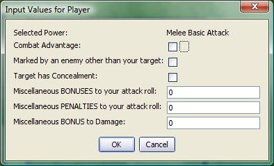
2. A more complex input, including LABEL, CHECK, and TEXT fields.
[h:status=input(
	"junkVar|"+powerClicked+"|Selected Power|LABEL",
   	"ComAdv|0|Combat Advantage|CHECK",
	"MarkPenalty|0|Marked by an enemy other than your target|CHECK",
	"TargetConcealed|0|Target has Concealment|CHECK",
	"MiscBonus|0|Miscellaneous BONUSES to your attack roll",
	"MiscPenalty|0|Miscellaneous PENALTIES to your attack roll",
	"mdb|0|Miscellaneous BONUS to Damage")]
[h:abort(status)]
Displays:
Recall that junkVar, as the variable name for a LABEL control, has no value assigned to it. In this example, we assume powerClicked is a variable that is passed in some fashion to the macro generating this input. It is incorporated using the standard method of concatenating a variable into a string ("string text"+variable+"more string text"). Finally, observe that the variable status is assigned the value returned by the input() function, and the abort() function is called using the value of status. In this fashion, the macro is terminated if the user clicks the Cancel button or hits the ESC key.
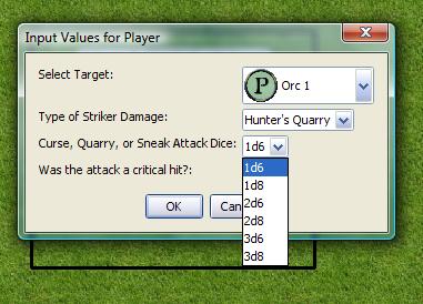
3. An input showing several LIST boxes, as well as the VALUE=STRING option.
[h:status=input(
		"targetNum|"+imgList+"|Select Target|LIST|SELECT=0 ICON=TRUE ICONSIZE=30",
		"feature|Hunter's Quarry, Sneak Attack, Warlock's Curse|Type of Striker Damage|LIST|SELECT=0 VALUE=STRING",
		"CQSDice|1d6,1d8,2d6,2d8,3d6,3d8|Curse, Quarry, or Sneak Attack Dice|LIST|SELECT=0 VALUE=STRING",
		"critAttack|0|Was the attack a critical hit?|CHECK"
		)]
Displays:
Note that the prompt section for each list contains a list of items, or a variable containing a string list (e.g., the variable imgList). In the first list, the ICON and ICONSIZE options are set, because that list contains image asset URLs for token images. In the second two lists, the VALUE=STRING option is set so that the value in the corresponding variable is the actual string (e.g. "Sneak Attack") rather than the index of the list item.
