input: Difference between revisions
Verisimilar (talk | contribs) (Cleaned up formatting and added some additional notes.) |
Verisimilar (talk | contribs) mNo edit summary |
||
| Line 3: | Line 3: | ||
|version=1.3b42 | |version=1.3b42 | ||
|description= | |description= | ||
Allows the user to input several values at once via a modal dialog. The function takes one or more string arguments, one for each variable requiring assignment. | Allows the user to input several values at once via a modal dialog. The function takes one or more string arguments, one for each variable requiring assignment. Execution of the calling macro is paused while waiting for the user to interact with the input dialog. | ||
Returns {{code|1}} if the user clicked the '''OK''' button, or {{code|0}} if they clicked '''Cancel''' (or hit Esc to exit the dialog). If {{code|input()}} returns 0, no variable assignments were made. | Returns {{code|1}} if the user clicked the '''OK''' button, or {{code|0}} if they clicked '''Cancel''' (or hit Esc to exit the dialog). If {{code|input()}} returns 0, no variable assignments were made. | ||
| Line 14: | Line 14: | ||
</source> | </source> | ||
'''Parameters''' | '''Parameters''' | ||
{{param|inputField|A string containing various 'sub-parameters' that set the type and options of each {{code|inputField}}; requires at least one {{code|inputField}} but will accept a reasonably large amount. You declare the 'sub-parameters' of each inputField in the following manner: | {{param|inputField|A string containing various 'sub-parameters' that set the type and options of each {{code|inputField}}; requires at least one {{code|inputField}} but will accept a reasonably large amount. The {{code|inputField}}s can be set using a series of individual parameters, or as one or more [[String List]]s. If a [[String List]] is used, the delimiter must be {{code|"##"}}. You declare the 'sub-parameters' of each {{code|inputField}} in the following manner: | ||
** {{code|"variableName{{!}}value{{!}}prompt{{!}}inputType{{!}}options"}} }} | ** {{code|"variableName{{!}}value{{!}}prompt{{!}}inputType{{!}}options"}} }} | ||
'''Sub-Parameters | '''Sub-Parameters | ||
| Line 91: | Line 91: | ||
=====TAB Options===== | =====TAB Options===== | ||
{{param|SELECT{{=}}TRUE|Causes this tab to be displayed when the dialog appears; defaults to {{code|SELECT{{=}}FALSE}}.}} | {{param|SELECT{{=}}TRUE|Causes this tab to be displayed when the dialog appears; defaults to {{code|SELECT{{=}}FALSE}}.}} | ||
---- | |||
''' | '''TAB Example''' | ||
<source lang="mtmacro" line> | <source lang="mtmacro" line> | ||
[H: input( | [H: input( | ||
Revision as of 17:31, 28 June 2009
input() Function
Returns 1 if the user clicked the OK button, or 0 if they clicked Cancel (or hit Esc to exit the dialog). If input() returns 0, no variable assignments were made.
Usage
input(inputField, ..., ...)Parameters
inputField- A string containing various 'sub-parameters' that set the type and options of eachinputField; requires at least oneinputFieldbut will accept a reasonably large amount. TheinputFields can be set using a series of individual parameters, or as one or more String Lists. If a String List is used, the delimiter must be"##". You declare the 'sub-parameters' of eachinputFieldin the following manner:"variableName|value|prompt|inputType|options"
Sub-Parameters
variableName- The name of the variable to which the value of the inputField is assigned.value- The initial value present in the dialog box. If not present, it defaults to0. In some cases you use a special syntax to indicate multiple values.prompt- The prompt displayed to the user to indicate the meaning of theinputField.inputType- Describes the type of input control presented to the user. Each of the different types are described in more detail below.options- Contains one or more options that control the appearance of the input control or how information entered in the control is treated; options are given in the formatoption=valueand separated by a space.
Input Types and Options
TEXT
Creates a text box containing the value or 0. The contents typed in the box are assigned to the variable, and there is no limit to the length of the data that can be entered.
TEXT Options
WIDTH=nnn- Sets the width of the text box; defaults toWIDTH=16.SPAN=TRUE- Causes thepromptto be hidden and allows theinputFieldto span the width of the dialog; defaults toSPAN=FALSE. If hidden theprompttext is used as a tooltip.
LIST
Creates a drop-down list of choices. The variable is assigned the index (starting at 0) of the item that was selected. The value sub-parameter is a comma delimited list of the values that can be chosen.
LIST Options
SELECT=nnn- Sets the index of the initial selection in the drop-down list (the first item is number0); defaults toSELECT=0.VALUE=STRING- The variable is assigned the string contents of the selected item instead of the index; defaults toVALUE=NUMBER.ICON=TRUE- If the string for the item contains a space and then an image asset URL, the image is displayed in the entry; defaults toICON=FALSE. Text before the URL is used for the entry's text. The getTokenImage() and getStateImage() functions can be used to obtain asset URLs.ICONSIZE=nnn- The size the icons; defaults toICONSIZE=50. All icons are stretched to fit a square this size. If the asset URL points to an image that is not square, some distortion will occur.TEXT=FALSE- No text is shown in the list entries next to the icons; defaults toTEXT=TRUE, and is ignored if no icon is set.SPAN=TRUE- Causes thepromptto be hidden and allows theinputFieldto span the width of the dialog; defaults toSPAN=FALSE. If hidden theprompttext is used as a tooltip.
CHECK
Creates a checkbox. The variable is assigned either 0 (unchecked) or 1 (checked).
CHECK Options
SPAN=TRUE- Causes thepromptto be hidden and allows theinputFieldto span the width of the dialog; defaults toSPAN=FALSE. If hidden theprompttext is used as a tooltip.
RADIO
Creates a group of radio buttons. This option works much like LIST, returning the index of the choice that was selected.
RADIO Options
ORIENT=H- Arranges the radio buttons horizontally on a single line; defaults toORIENT=V.SELECT=nnn- Sets the initially selected radio button (the first item is number0); defaults toSELECT=0.VALUE=STRING- The variable is assigned the string contents of the selected item instead of the index; defaults toVALUE=NUMBER.SPAN=TRUE- Causes thepromptto be hidden and allows theinputFieldto span the width of the dialog; defaults toSPAN=FALSE. If hidden theprompttext is used as title placed in the border of the radio button group.
LABEL
Creates a static label. The variableName is ignored, and nothing is assigned to it.
LABEL Options
ICON=TRUE- If the string for thevaluecontains a space and then an image asset URL, the image is displayed; defaults toICON=FALSE.ICONSIZE=nnn- The size the icon; defaults toICONSIZE=50. The icon is stretched to fit a square this size. If the asset URL points to an image that is not square, some distortion will occur.TEXT=FALSE- Thevalueis not shown; defaults toTEXT=TRUE.SPAN=TRUE- Causes thepromptto be hidden and allows theinputFieldto span the width of the dialog; defaults toSPAN=FALSE. If hidden theprompttext is used as a tooltip.
PROPS
Creates a bordered sub-area containing multiple text boxes, one for each entry in a String Property List stored in value. The variableName is assigned a new string property containing all the entries with their updated values.
PROPS Options
SETVARS=SUFFIXED- Makes a variable assignment for each of the sub-values, with an underscore appended to the name; defaults toSETVARS=NONE.SETVARS=UNSUFFIXED- Makes variable assignments to unmodified variable names.SUFFIXEDis usually preferred, unless you are not using variable names that match Token Properties or if you specifically intend to overwrite them.)SPAN=TRUE- Causes thepromptto be hidden and allows theinputFieldto span the width of the dialog; defaults toSPAN=FALSE. If hidden theprompttext is used as title placed in the border of thePROPSgroup.
TAB
Creates a tab for a tabbed dialog box. The varialbeName variable gets assigned a String Property List containing all the variable assignments made on this tab. Since some of the variables may be property strings themselves, the tab property string uses the non-default delimiter "##". When using tabs, the first inputField must be a TAB.
TAB Options
SELECT=TRUE- Causes this tab to be displayed when the dialog appears; defaults toSELECT=FALSE.
TAB Example
[H: input(
     "tab0 | Info || TAB",
     "Name ## Rank ## Serial number | 1,2,3 || LIST",
     "tab1 | Abilities || TAB",
     "Strength ## Dexterity ## Wisdom"
)]
Examples
[input("AtkBonus", "DmgBonus", "CombatAdvantage")]Displays:
Note that only the variableName is required to generate an input dialog - if that is all that is provided, input() assumes that each variableName will be assigned using a text field.
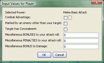
2. A more complex input, including LABEL, CHECK, and TEXT fields.
[h:status=input(
    "junkVar|"+powerClicked+"|Selected Power|LABEL",
    "ComAdv|0|Combat Advantage|CHECK",
    "MarkPenalty|0|Marked by an enemy other than your target|CHECK",
    "TargetConcealed|0|Target has Concealment|CHECK",
    "MiscBonus|0|Miscellaneous BONUSES to your attack roll",
    "MiscPenalty|0|Miscellaneous PENALTIES to your attack roll",
    "mdb|0|Miscellaneous BONUS to Damage")]
[h:abort(status)]
Displays:
Recall that junkVar, as the variableName for a LABEL control, has no value assigned to it. In this example, we assume powerClicked is a variable that is passed in some fashion to the macro generating this input. It is incorporated using the standard method of concatenating a variable into a string ("string text"+variable+"more string text"). Finally, observe that the variable status is assigned the value returned by the input() function, and the abort() function is called using the value of status. In this fashion, the macro is terminated if the user clicks the Cancel button or hits the ESC key.
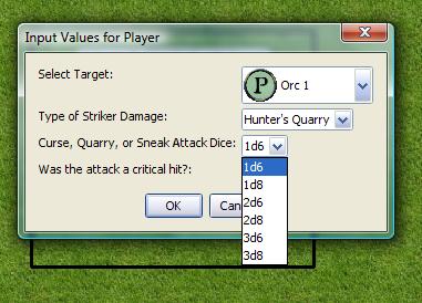
3. An input showing several LIST boxes, as well as the VALUE=STRING option.
[h:status=input(
    "targetNum|"+imgList+"|Select Target|LIST|SELECT=0 ICON=TRUE ICONSIZE=30",
    "feature|Hunter's Quarry, Sneak Attack, Warlock's Curse|Type of Striker Damage|LIST|SELECT=0 VALUE=STRING",
    "CQSDice|1d6,1d8,2d6,2d8,3d6,3d8|Curse, Quarry, or Sneak Attack Dice|LIST|SELECT=0 VALUE=STRING",
    "critAttack|0|Was the attack a critical hit?|CHECK"
)]
Displays:
Note that theprompt section for each list contains a list of items, or a variable containing a String List (e.g., the variable imgList). In the first list, the ICON and ICONSIZE options are set, because that list contains image asset URLs for token images. In the second two lists, the VALUE=STRING option is set so that the value in the corresponding variable is the actual string (e.g. "Sneak Attack") rather than the index of the list item.
